
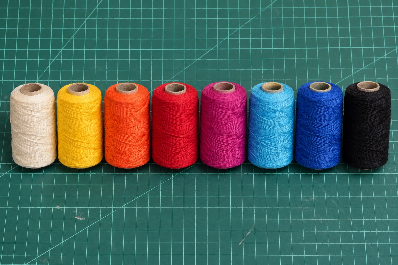
Choose a small palette with a purpose
Start with the mood of the piece: warm and playful, cool and graphic, or soft and quiet. A small group of colors is easier to judge than a drawer full of thread. Try a dark blue for structure, coral for warmth, and a pale background to give both room to breathe. Keep the palette tied to the subject rather than adding a color simply because it is available.
The studio’s experimental color mode supports up to ten thread colors. The color swatches describe the thread you plan to use, not a guarantee of an exact physical match. Choose colors close to the actual spools in your workshop. If your thread is duller or darker than the screen sample, adjust the sample before generating a second version.
Let the background do some of the work
Light areas are valuable. They separate a cheek from a shadow, petals from a stem, or one part of a geometric motif from another. Several vivid colors layered densely across the same area can still become a dark mass. First check whether the composition reads with fewer connections, then add density only where the subject needs it.
A white or pale board makes a useful first material test. The screen is a simplified representation of overlapping lines; it does not predict dye, sheen, shadows, or the exact optical mixing of real fibers. Changing the board finish after generating the pattern may change the entire balance.
Treat each layer as its own thread
Color patterns include separate layer paths. Work in the exported order. At a layer change, finish and secure the current thread, then tie the new color onto the first nail specified for that layer. Do not stretch a connecting strand from the end of one layer to the start of the next unless the instructions explicitly include it.
Keep spool labels next to your printed color key. Two blues can look almost identical under a warm desk lamp. If you pause during a change, write down whether the old layer is finished and whether the new thread is already tied on. Step numbers and nail numbers serve different purposes: one records your place in the sequence, the other identifies a physical anchor.
Make a swatch before the full piece
On scrap material with the same finish, make a small set of crossings with each color and a patch where they overlap. View it from the distance at which the final artwork will hang. Look for muddy overlaps, fibers that fray around nail heads, or a shiny thread that catches too much light.
Color mode is experimental. Use it for studies and small material tests before a large portrait. The studio does not simulate real thread pigments, translucency, or layer height.
Keep the best swatch alongside a saved project and note the thread brand, color, and thickness. Those physical notes are more useful for reproducing a result than a screenshot alone. Browse the color-field references for a different way to think about color and space.
Put it into practice
Try your image, inspect the preview, and save the pattern that works for your project.
Open the generator